During the 2010s, I designed websites. I built them with HTML/CSS/JS. I made custom themes for WordPress. Now in 2020s, I reposition myself for a Front-End career. I’ve started learning React and related stuff along with TypeScript. I’ll share what I’ve learned during this journey.
Produced: 2020-2021 Used: HTML / SCSS / JavaScript / WordPress Responsive design: Yes Live site:turkiyedeagirmuzigingecmisi.com (in Turkish)
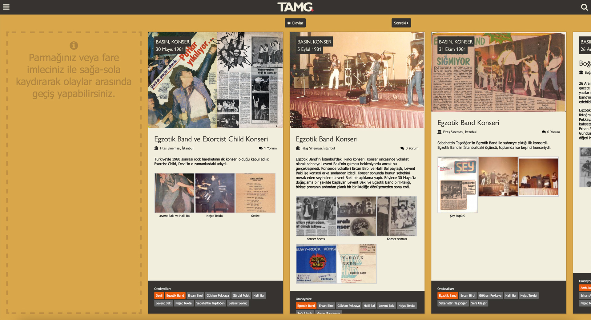
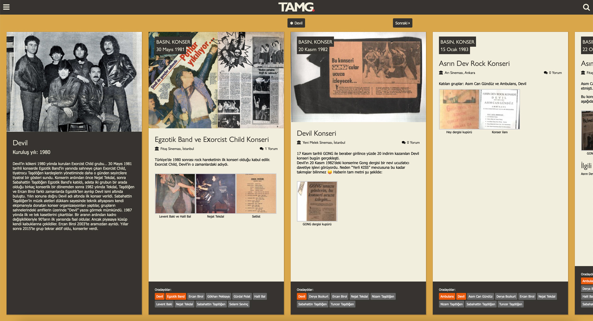
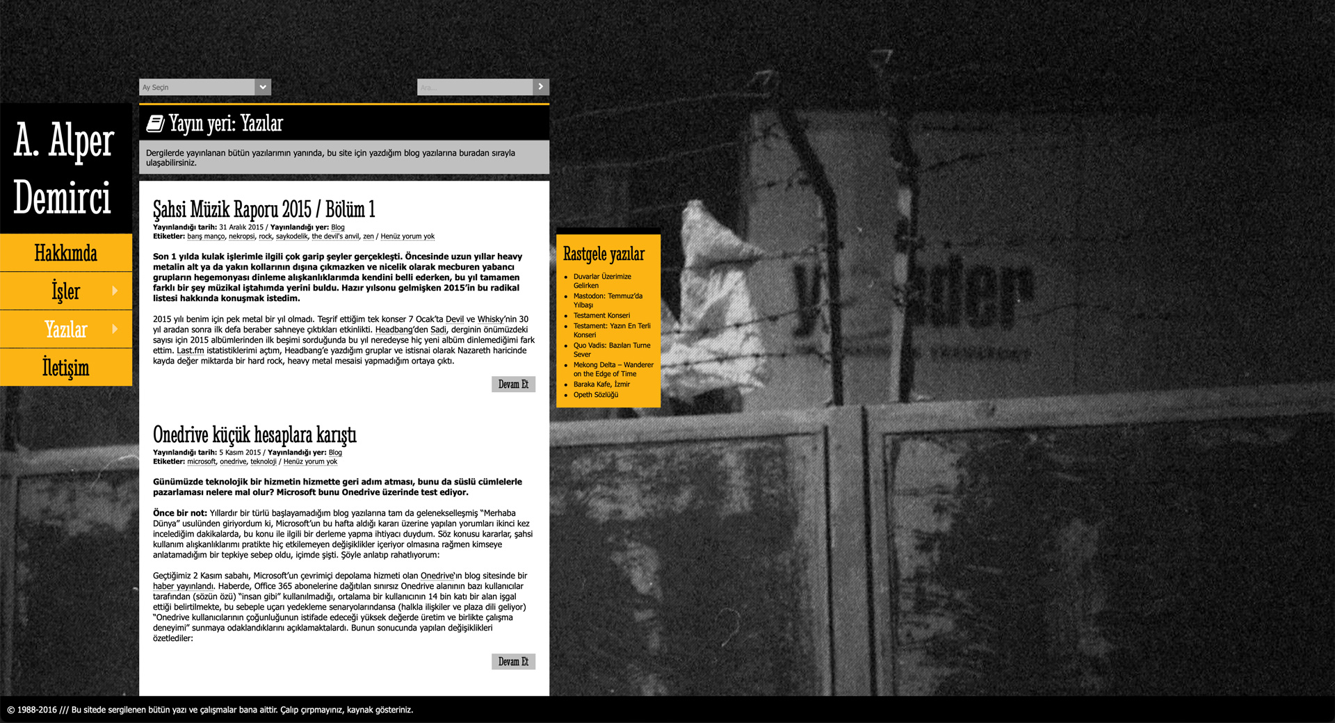
TAMG is my music archive project, translated as “History of Heavy Music in Turkey”. It started as a Facebook page in 2012, and became a trans-media project in 2019 with the addition of contents in Twitter, YouTube and podcast. Central to the project is the website, which was published in 2021. The idea is a horizontal timeline of events. The user goes back in time by dragging the screen horizontally.
• I felt innovative as I coded the design for TAMG since I was coding a horizontal website for the first time. The timeline makes the user travel in time. Click “Olaylar” on the homepage to see the timeline.
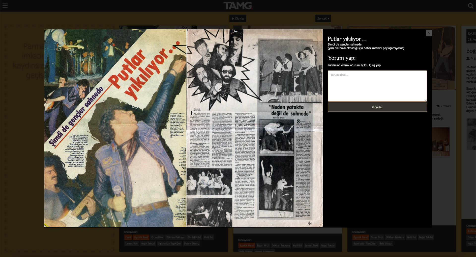
• Having roots in Facebook as a page, I customised the Featherlight.js lightbox plug-in to show the archive documents in big picture with its description and comments section. The lightbox is shaped after the dimensions of the original image file and it’s fully responsive. If the original image is huge, then it is resized to fill the screen. That wasn’t a feature of Featherlight.js, I remember having long sessions of JavaScript coding.
• The timeline can be filtered by bands, people, location, and event type. Pages for bands and people become a “profile page”.
Current personal website
Produced: 2020 Used: HTML / SCSS / JavaScript / WordPress Responsive design: Yes Multilingual: Yes Live site:aademirci.com
My previous personal website had some problems:
It didn’t use the screen estate effectively in desktop mode: Half of the screen was blank image.
A long text greeted the visitors, “about” page and the homepage was the same.
All of the elements were out of emphasis.
So I started a redesign in 2016. I bought a new domain in 2018. I was only able to publish the website after many radical changes and iterations in 2020. But the result solves the problems mentioned above:
New fluid design utilises every inch of the screen regardless of screen size.
Minimalist attitude that eliminates long greeting texts and menu items. I define myself instead with a custom WordPress post type “Personas”, as I call them. It is a richer, more organised alternative to an “about me” article.
Everything is big “enough”. On desktop, text is really big as we humans have some distance to the monitor. As the device gets smaller, the distance is also smaller, so the text also gets smaller. Hierarchy among the elements is clean, emphases on titles and introductory text are high.
This version of my personal website facilitates visitors to know about me as well as showcases my magazine articles and blog posts much better than the previous version.
The language of the website was Turkish in the beginning, and then I switched completely to English. By the start of 2024, I learned how to properly create a multilingual WordPress theme and now I have a bilingual website (with some modern CSS features and much less JavaScript).
And since you already browse this website, no screenshot is needed 🙂
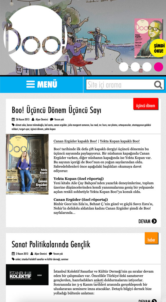
Boo! was a culture and arts magazine from Turkey, published in Turkish. Find more details in my editor persona. Here are some reincarnations of the website, if not all.
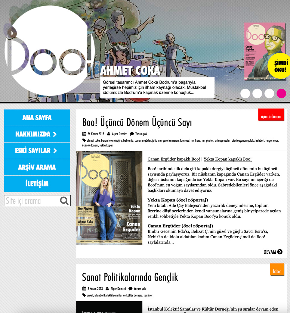
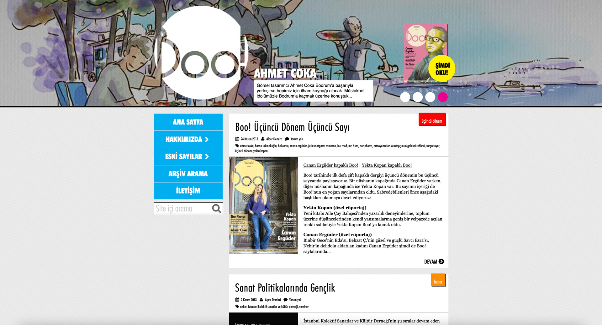
• The website I crafted for the 3rd season of the magazine was a responsive theme built to use with WordPress content management system (2013). It transformed according to the width of the browser, so it was mobile-friendly. This was my first attempt at responsive design.
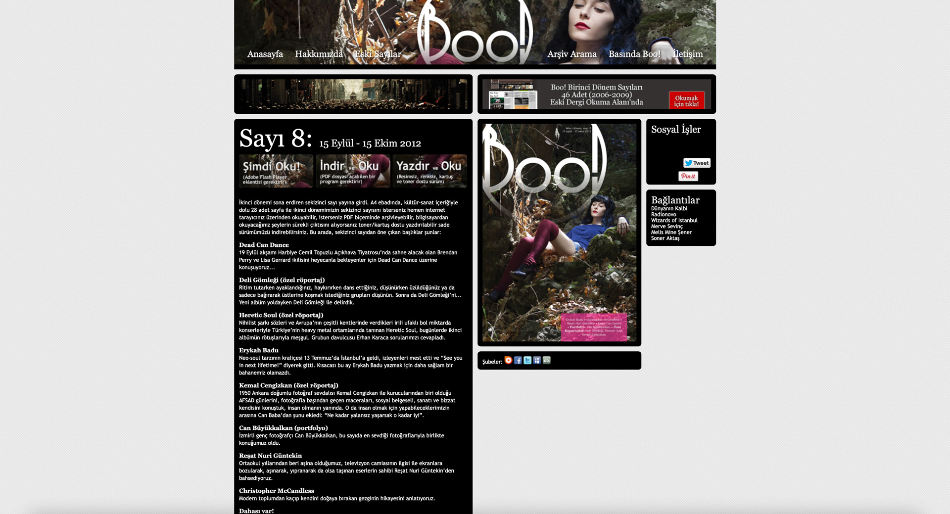
• However, previous website was completely static (2012). It was so static that I used to update the content from HTML files, there was no WordPress used for the sake of minimalism.
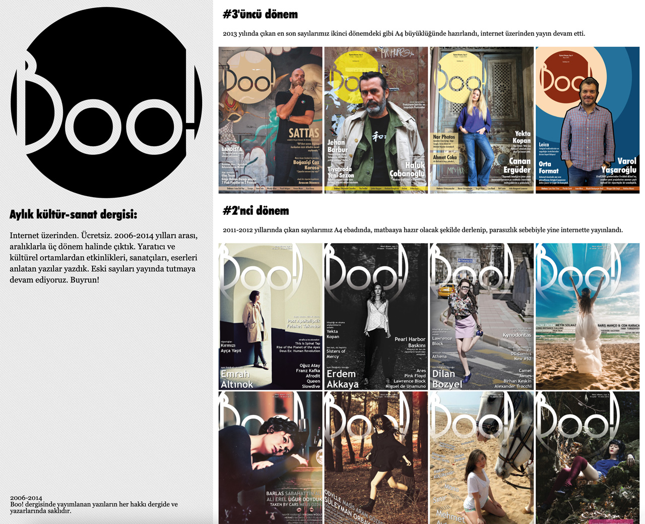
• Finally, after the third season, I switched to this webpage for the hiatus period of the magazine just to focus on the issues we published in the past (2014).
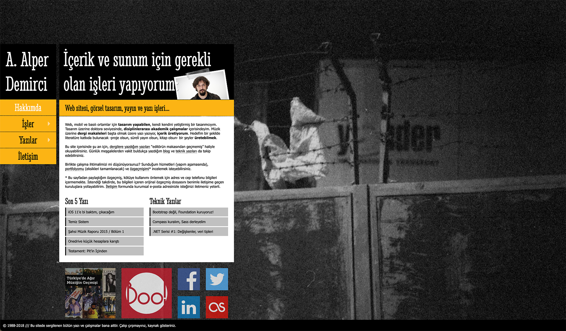
Former personal website
Produced: 2012 Used: HTML / CSS / Adobe Photoshop / WordPress Responsive design: Partly, later
Before aademirci.com, I used to use the alperdemirci.com domain. It still exists, but redirects here. And it represents the previous design of my personal website.
In 2012, I wanted to design a website that showcases my articles published in several magazines. So I started to build a WordPress theme from scratch. I was learning the basics of responsive web design later next year, and applied all of these learnings. It thus became a mobile-friendly website. Beautifully crafted in HTML and CSS, early versions lacked need for JavaScript but later I managed to adapt a slider to the main page.
It represented my articles in an organised design.